Building a Design System for 6+ Product Teams
FTI had never had a design system before. Here’s how we built the first one from the ground up.
Role
Design system lead
Background
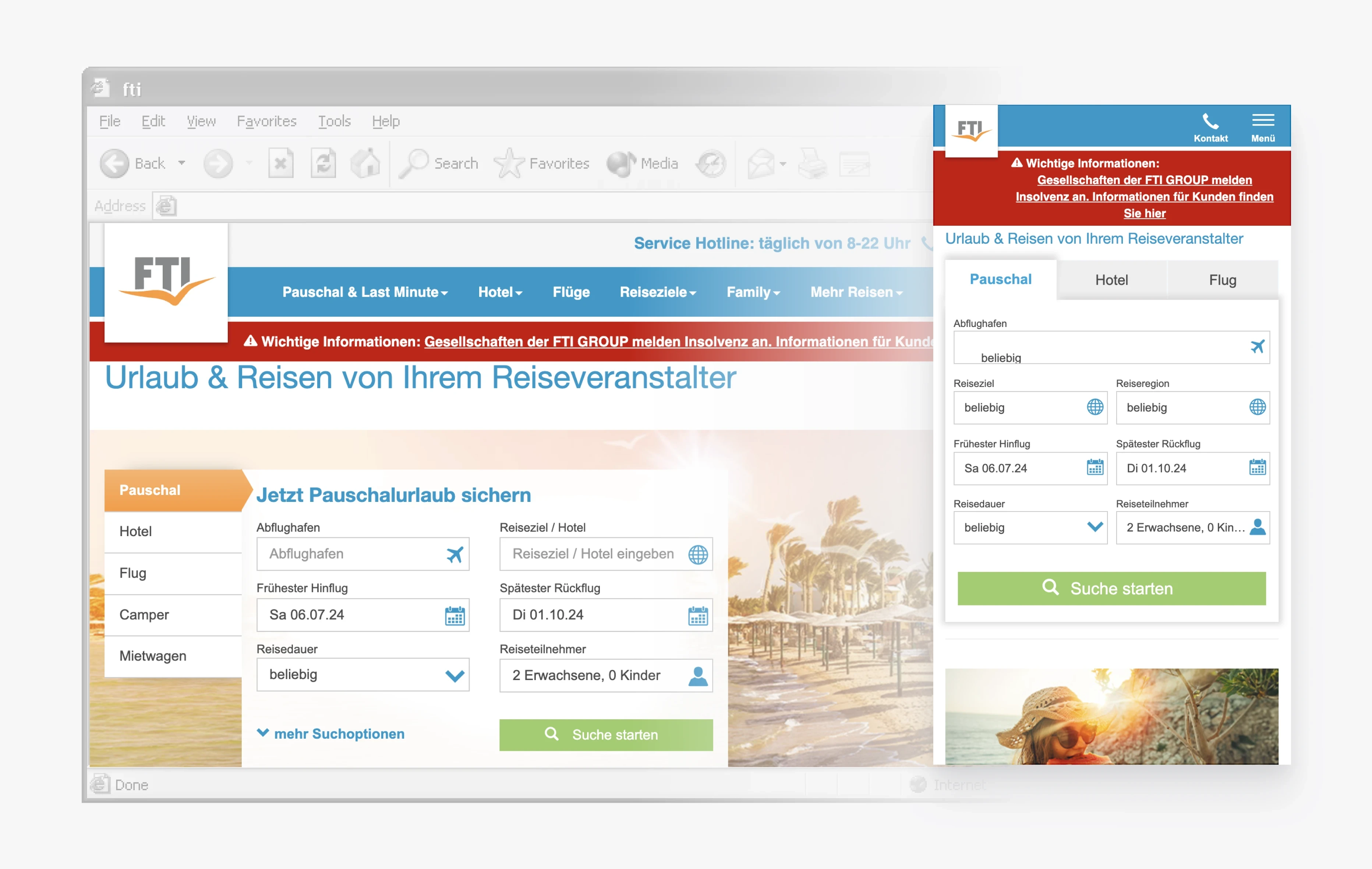
FTI Touristik, a Munich-based tour operator founded in 1983, offered a wide range of travel products across 120 countries and five continents.
After 40 years of generating 95% of its revenue through offline sales, the company decided to strengthen its digital presence. To support this shift, we began building Sunscreen—a foundation for more consistent, accessible, and engaging digital experiences.
My Role
As a Senior Product Designer, I led the strategy and design of Sunscreen, FTI’s first design system. In the Design System Squad, I worked with three other designers, four engineers, and one product owner.
I stayed hands-on throughout—defining principles, establishing the foundations, and creating components and documentation from the early stages to production.
Key contributions
Drove strategy and collaboration
by coordinating three other designers and working cross-functionally with engineers and a product owner to align decisions across the squad.
Standardized foundations
with design tokens, improving scalability, accessibility, and ease of maintenance.
Introduced a structured Figma workflow
with file organization, naming conventions, and status indicators, which improved collaboration and clarity across the team.
Crafted and prototyped global components
(Quick-Search, Header Navigation) through cross-team workshops, enabling adoption across products, earlier stakeholder validation, and smoother developer handoff.
Built documentation
in Zeroheight with Storybook integration, creating a single source of truth for six product teams.
The team
I led design in a squad of nine building for 32 people
Design
Lead (me) and 3 designers
Product
1 product owner
Engineering
4 developers
Built for
12 designers and 20 engineers, across 6 product teams
We began as a centralized team of three designers and a product owner, responsible for building and scaling the design system. Six months later, we hired a fourth designer to accelerate the documentation work.
Around the same time, FTI reorganized into Tribes and Squads. The work moved into a dedicated Design System Squad with four full-time developers. We worked in two-week sprints and shared progress with product teams in sprint reviews.
Challenges
Building the system was only part of the challenge. We also had to create shared foundations for six product teams while the products, teams, and operating model were still evolving.
When we began, the design team was brand new. There were no shared design files, existing pattern library, or established design processes to build on.
Key challenges
No existing component library
Everything had to be created from the ground up.
Accessibility issues
More than 60% of the existing palette did not meet WCAG 2.1 contrast requirements.
Inconsistencies across the product
Fragmented designs made scaling difficult.
Limited scalability
Existing product patterns could not support future features.
Slow delivery
The lack of standards caused delays in design and development.
Design System as a Product
Product designers were its direct users, while customers were the end users affected by every decision.
Our goal was to give product designers and developers the tools, building blocks, and guidelines to solve problems and ship faster.
The system emphasized: Consistency, scalability, efficiency, and accessibility.
Process
Our user experience researcher conducted ongoing interviews that helped us understand the needs and behaviors of prospective users.
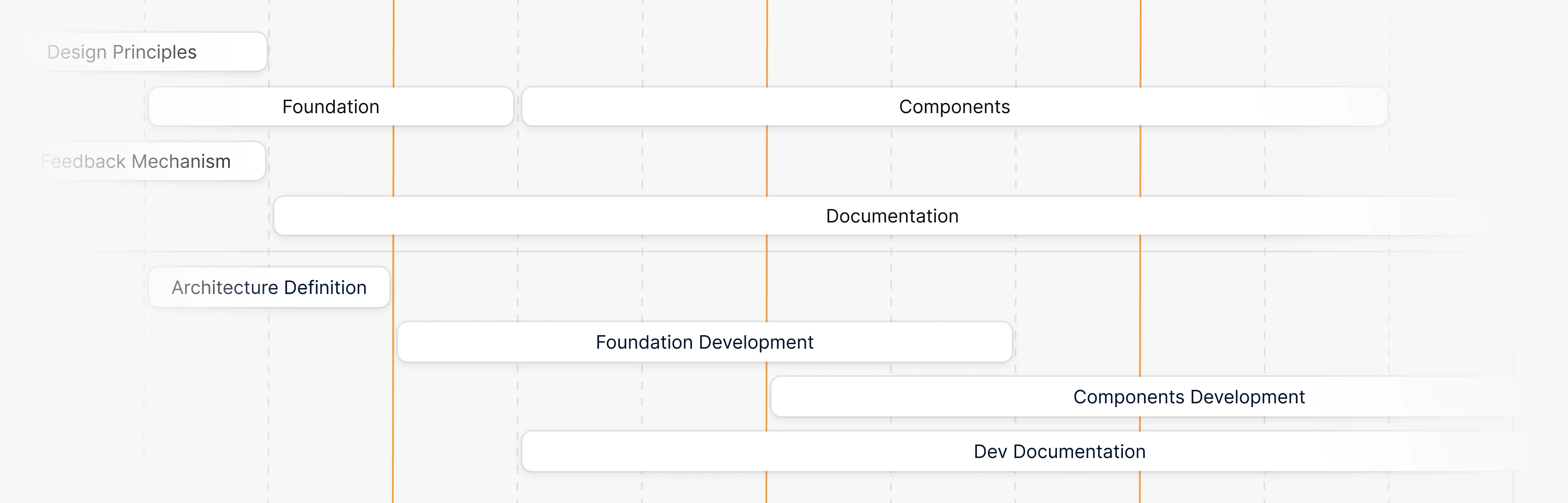
As the product direction became clearer, we worked iteratively with product owners, designers, and developers, using feedback and A/B tests to compare ideas and refine the work.
The Approach
We used Atomic Design for scalability and the Design System Maturity Model to define stages and milestones. The goal was a useful first version we could improve through feedback.
There’s no ‘I’ in ‘Team’
Communication with Product Teams
Regular meetings and workshops let product teams challenge the work and contribute their expertise. Their feedback kept the system grounded in real product needs.
Communication with Developers
Regular syncs with developers helped us review design decisions and technical constraints early. Their involvement kept the work feasible and prevented wasted effort.
The Foundation
Before designing the foundations, we studied public design systems—free and paid—to understand how other teams structured them, what worked, and where gaps remained.
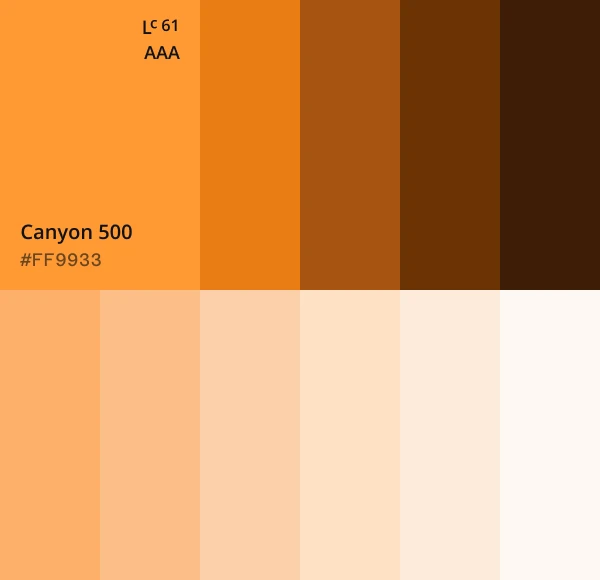

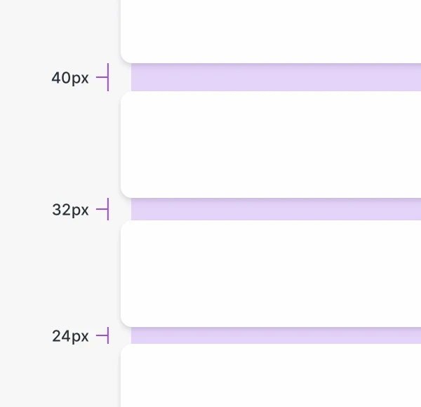
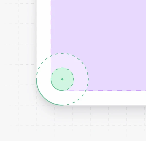
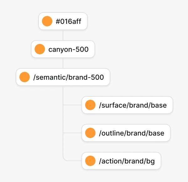
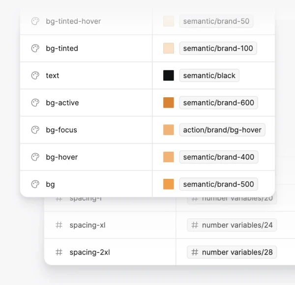
More than 60% of the existing palette did not meet WCAG 2.1 contrast requirements, and the palette lacked the tints, shades, and utility colors we needed. I introduced a more accessible, scalable color system.
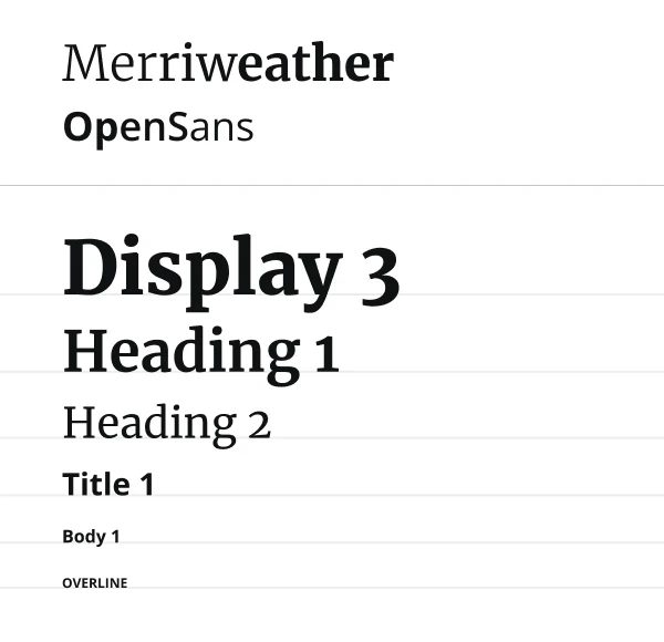
Alongside the color system, we established a typography scale for legibility and hierarchy, using a serif for headings and a sans serif for body text. We used Font Awesome icons as SVGs in Light, Regular, Solid, and Duotone styles, then defined elevation, spacing, and responsive grid systems.
Semantic Naming
We used descriptive names that reflected each foundation element’s purpose rather than its visual properties. This made the system easier to understand, scale, and maintain.
Design Tokens
I first experimented with the Figma Tokens plugin. When Figma released native Variables, I tested naming conventions and migrated the system—starting with color, then spacing and border radius.
Figma File Setup
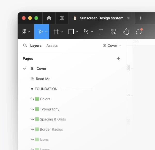
To make component status clear, I organized the Figma file into Foundation, Components, and Local Components, using color-coded emojis to show each component’s status.
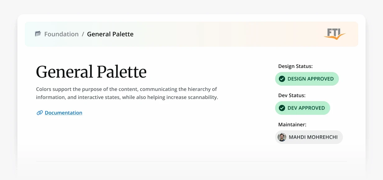
I also built a reusable header component that showed the development and design statuses, the maintainer, and documentation links.
Building the Core Components
We started with buttons and form fields, then moved to navigation bars and date pickers. Every component used the same tokens for color, typography, spacing, and radius.
Designers and developers reviewed each one together before it entered the library.
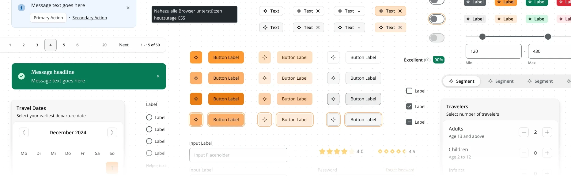
Detach? Nah! Compose it.
At first, we tried to foresee too many future needs and created variants that weren’t actually needed. We changed direction: instead of designing for every possible scenario, we focused on validated product needs and used flexible patterns for edge cases.
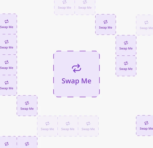
I introduced mutable slots as placeholders that could be swapped with other components without detaching them. This gave the components flexibility without forcing us to overbuild.
Building the Templates
Header Navigation & Quick-Search
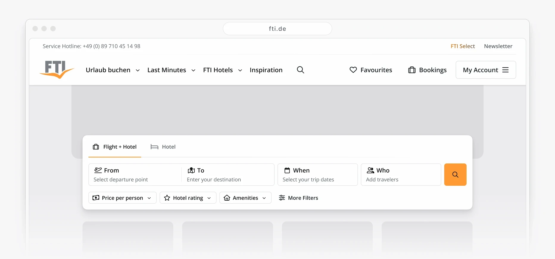
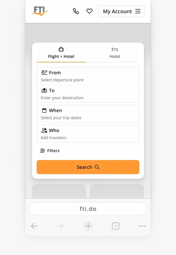
For the Header Navigation and Quick-Search, I stepped into product design and took ownership of two global components that were crucial to the product.
I worked with the SEO, SEA, Booking Engine, Portal, CRM, and Product teams through workshops to define requirements and improve the designs. The goal was to create a consistent, accessible experience across devices that could support future content and features.
I created interactive Figma prototypes for these global components so product designers and stakeholders could experience them, give feedback, and refine them before user testing.

From design to delivery
Implementation
Designers and developers worked together to implement the Figma tokens, components, and templates in Storybook. After testing and approval, they were made available to product teams.
Versioning
We used semantic versioning and a release-note template to make library changes clear to designers.
Documentation
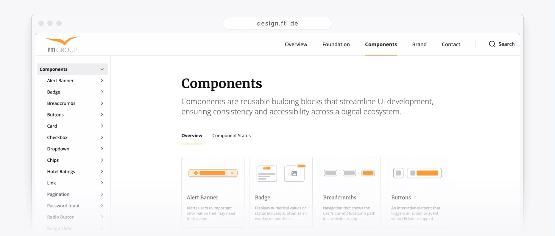
Zeroheight, connected to Storybook, became the shared source for principles, component guidance, examples, and dos and don’ts.
In use
Every component followed the same path. We designed it, developers coded it, we ran QA together, and then it went into a product.
Developers used the coded components on the Austrian website. This was a test rather than a full launch, so we could see how the system held up in a real product with real content.
At the same time, designers were building with the Figma library on other products. That gave us two sets of users reporting different problems.
Both groups sent issues back, and we refined the system while it was in use. It was still being built and already being used.
The End
We validated the coded Alpha, piloted it in Austria, and confirmed the accessibility improvements. We could not validate full adoption across the organization or its long-term effect on delivery.
We were close to launching the Alpha in July 2024, but FTI announced insolvency on June 1, 2024, and the work stopped before wider adoption.
Even without a full launch, we learned a great deal about building a design system while the teams and products around it were still changing.
© 2026 — Mahdi Mohrehchi