Redesigning Checkout to Reduce Cart Abandonment
How a research-led multi-step flow increased conversion by 15% at Esam.
Role
Design lead
Nearly a decade without a designer
Esam is an online auction and shopping platform founded in 2007, serving hundreds of thousands of active users. The checkout redesign was part of a wider product overhaul after nearly a decade without a dedicated designer or meaningful product-experience improvements.
I was the sole designer, responsible for leading the process from research and strategy through interaction design, validation, and delivery. Because the company was not design-led, part of the work was helping stakeholders understand product thinking and make space for evidence-based decisions.
A checkout losing 68.8% of carts
Analytics showed that 68.8% of carts were abandoned. Research traced the losses to three sources of friction at the point where users needed confidence most.
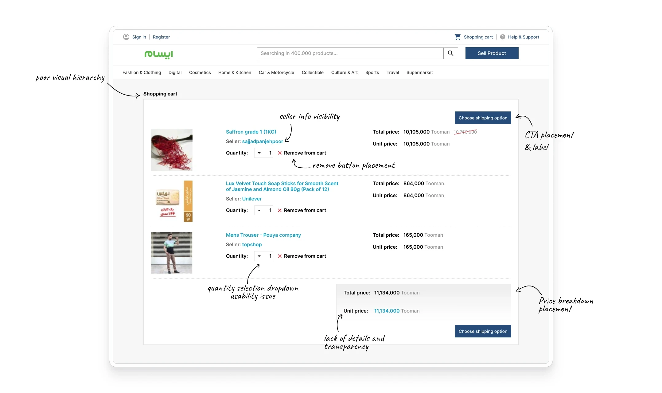
The three core problems:
Complex navigation
The flow made it difficult to understand where users were and what came next.
Inconsistent patterns
Visual and interaction inconsistencies increased cognitive load across the journey.
Low purchase confidence
Users worried about product quality and rarely noticed Esam’s money-back guarantee.
Making research possible
Stakeholders initially believed they already understood the users. I built trust by explaining the role of research and asked for one week to gather evidence before the team committed to a solution.
With a limited budget and no researcher, I leaned on evidence the company already had and on the support team’s access to customers, then mapped the checkout journey to locate the moments where confusion and doubt accumulated.
The evidence came from two directions:
Behavioral evidence
Existing analytics, support tickets, and social comments, plus 15 short calls with buyers that customer support arranged.
Product context
Interviews with every stakeholder on the project, plus a review of competing checkouts.
From observations to a focused goal
I synthesized the findings into problem statements and How Might We questions. We prioritized issues by user impact and implementation effort, then aligned on one goal: create a simple, fast, and reassuring checkout that increased completed purchases.
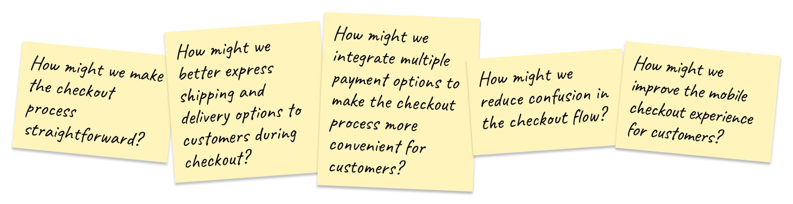
We tracked the goal against four measures:
One page or multiple steps?
Low-fidelity concepts let us compare two directions quickly before committing engineering effort.
One-page checkout
Putting everything on one screen removed steps but increased cognitive load. Early feedback showed that users still felt unsure about their selections and hesitated to purchase.
Multi-step checkout
Grouping related decisions into clear steps reduced overload and gave users confidence that they had not missed anything. This direction tested better and became the foundation of the final flow.
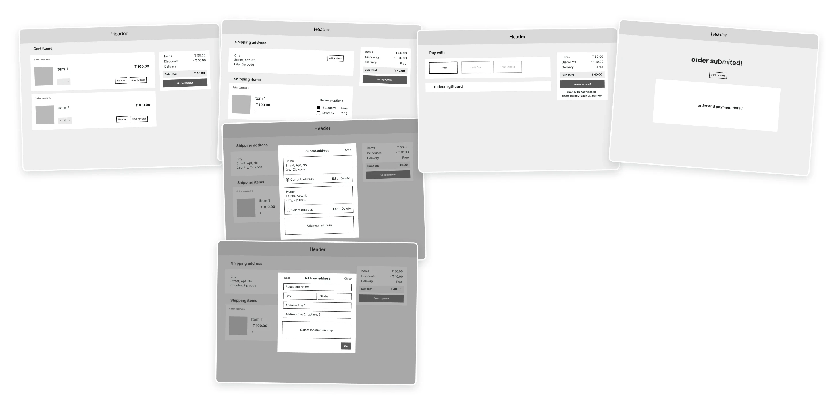
I refined the multi-step journey using feedback and defined the information architecture for each stage.
Step 1
Cart
Items, quantities, and price
Step 2
Shipping
Address and delivery option
Step 3
Payment
Method and confirmed cost
Step 4
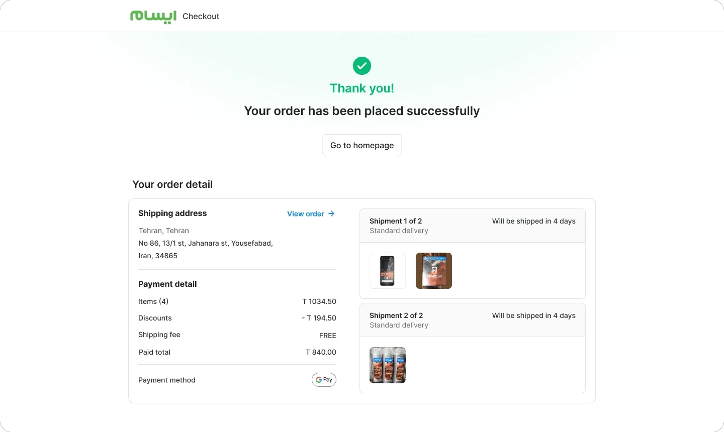
Confirmation
Order summary and receipt
Validate the flow before redesigning the UI
To isolate the effect of the new journey, we tested the multi-step flow while keeping the old visual design. The result validated the direction before the team invested in full implementation.
+12%
Conversion, multi-step flow on the existing UI
Designing around each decision
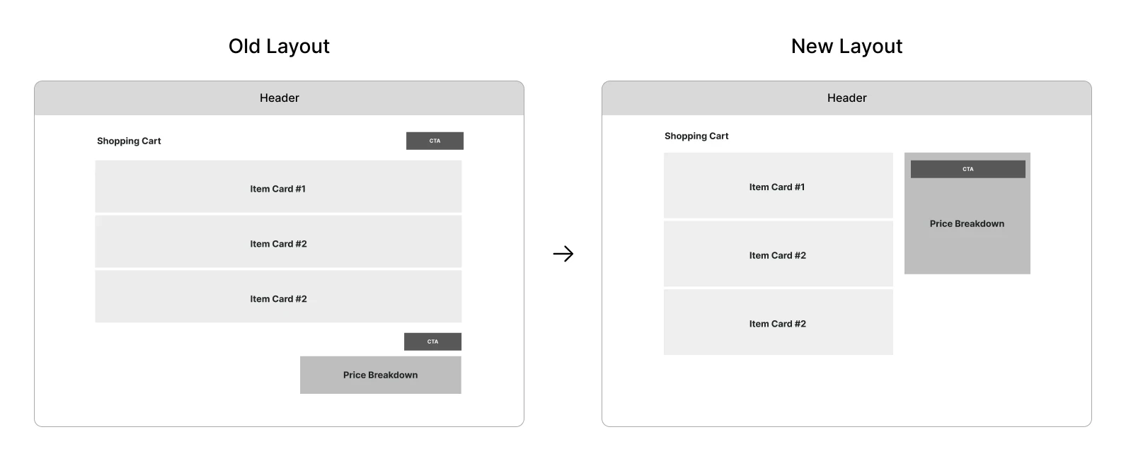
The new layout gave each checkout step a focused content area while keeping the price breakdown and primary action in a consistent panel on the right. Only the step content changed, so users always knew where to confirm cost and continue.
Low-fidelity wireframes helped stakeholders and engineers resolve information, API, and technical constraints before the visual layer was added.
High-fidelity solution
With the flow and information architecture validated, I applied Esam’s design system and refined the experience around three priorities: clarity, trust, and cross-device completion.

New layout and visuals
A persistent right-hand summary kept price details and the primary action visible while the main area handled each step’s decisions.

Trust building
I surfaced Esam’s money-back guarantee on the product and checkout pages, making existing protection visible when users needed reassurance.
Mobile optimization
The responsive flow removed nonessential elements, used accessible controls, and maintained touch-friendly targets. The goal was not merely to fit the desktop design onto a smaller screen, but to improve purchase completion for mobile users.
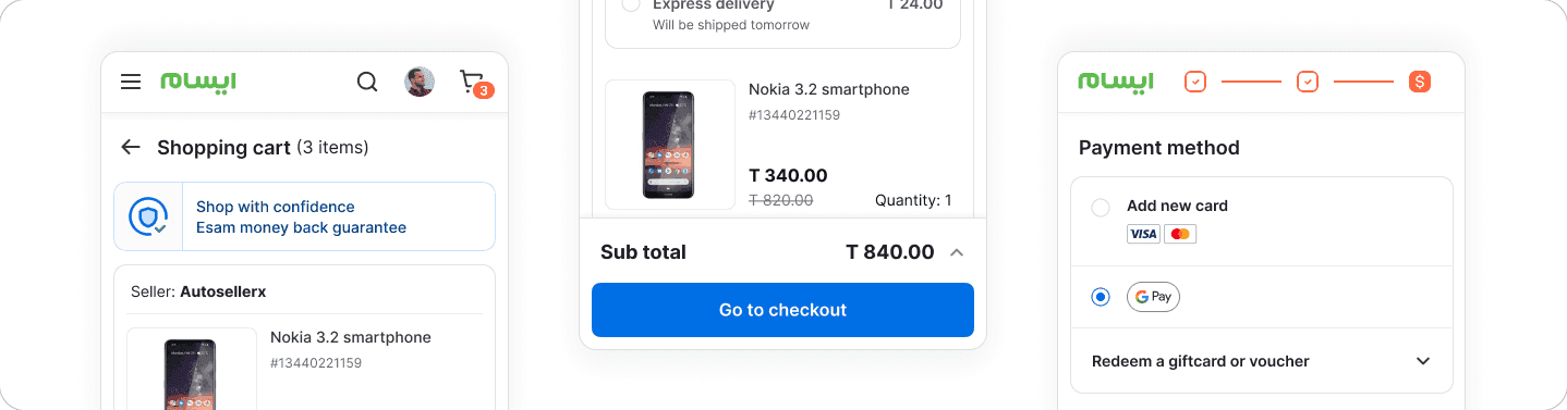
The complete desktop journey
The final checkout adapted across large screens, smaller laptops, and tablets while preserving the same information hierarchy and persistent order summary.


Testing the final experience
We ran an unmoderated remote usability test of the high-fidelity desktop prototype, then iterated on the final designs before launch.
Six participants
Aged 20–50, with each step recorded and reviewed against the needs identified during research.
Two changes
Simplified navigation and more visible payment options.
Impact after 60 days
The redesigned checkout improved conversion, average order value, and payment success during the first 60 days after launch.
+15%
Conversion rate
+8%
Average order value
+10%
Payment success rate
© 2026 — Mahdi Mohrehchi